Branding
Community Care Centre
Logo Design | Applications | Marketing Materials
First steps
Mood Board
The Community Action Centre was renamed Community Care Centre (CCC) and they needed a logo and rebranding.
The mood board on the left has several concepts of what the CCC wanted to communicate: care, love, community, centre, crafts, support and healing.
The design
Font
The CCC wanted the new logo to have a connection with their old one. I selected the HWT Artz font because it is similar to the font they used in the past, but with softer edges and rounded ends. This softer look creates a sense of care and love that they were looking for. Additionally, the font has good readability.
The Design
Logo Design
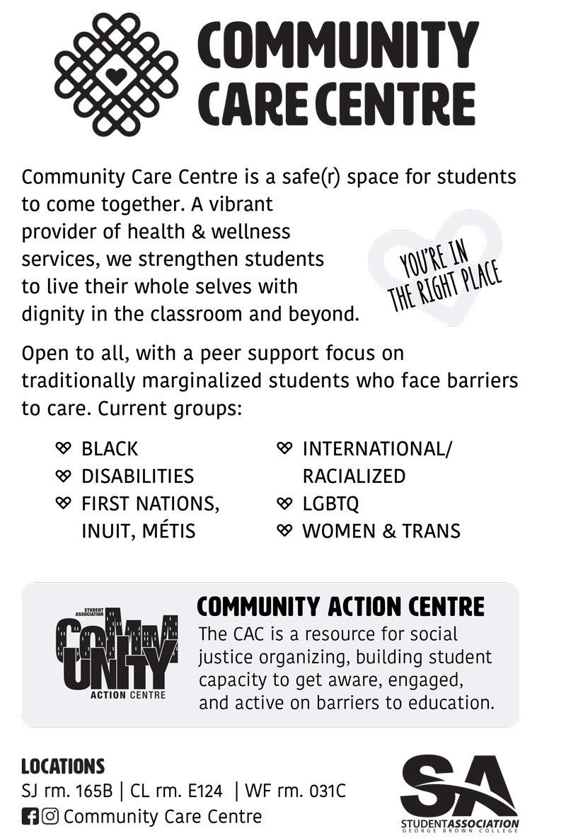
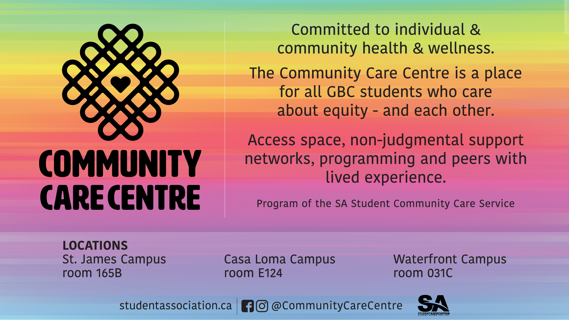
For the logo, I created a grid as a symbol of the connections in a community, with a heart in the center to show that care happens in community.
I used curved lines to create the grid so the logo communicates softness and as a symbol of a paperclip holding a community together.
Finally, the intersections also create hearts in the corners to complement the idea of care and love that the CCC wanted to communicate through their logo.
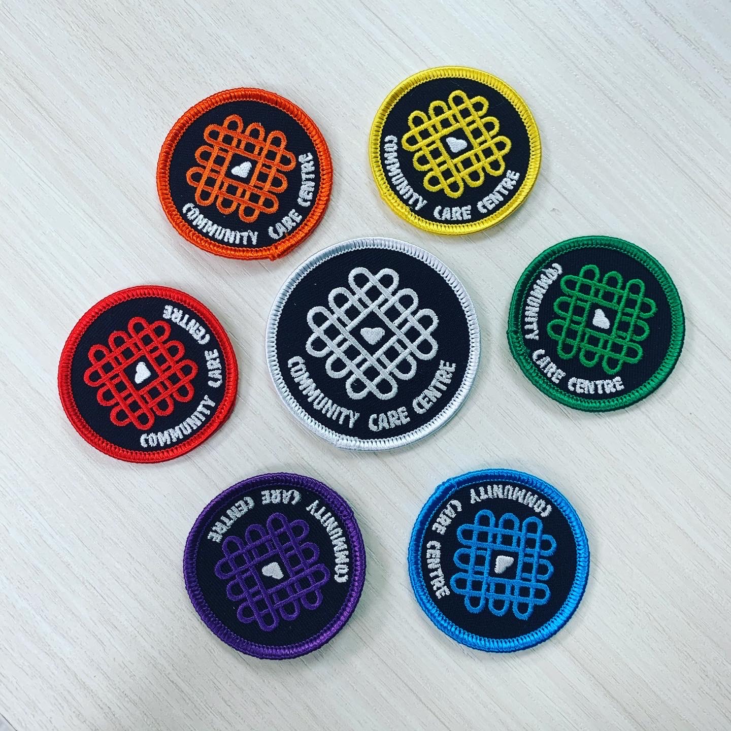
logo variations
Horizontal Version, Logomark and Special Editions
The CCC needed different variations of their logo to adapt to different media and sizes.
I created a horizontal version, a logomark for smaller applications and some colour variations that they could use during Pride or other important events.
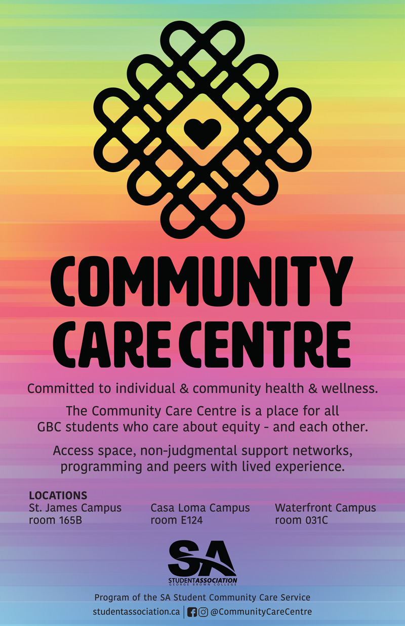
Design Applications
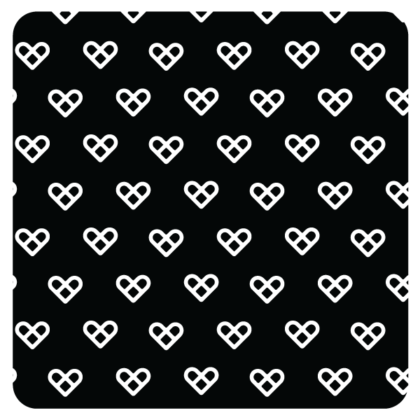
Pattern
The CCC staff were thrilled with the logo and the logomark, so they wanted to create more applications for it. I created a pattern using the logomark, that they used after to create cushions, custom fabric, bulletin boards and clothing pieces.
Design applications
Final Logo Applications
Get In Touch
Let’s Work Together!
hello@rominaavila.com